2021 MFA THESIS:
GRATITUDE
GERDY’S COMMUNITY MARKET
MOSS THORNS GALLERY, FORT HAYS STATE UNIVERSITY
-
Gratitude is a concept that has impacted my life in an enormous way. Along with being a key element in this exhibition, it blends in well with me as a person and my personal life. I am extremely blessed to have the heritage that I do from both sides of my family. Gerdy’s Community Market was built on that same family concept. The gratitude celebrated after a harvest with family and community is the foundation that Gerdy’s was built on. I wanted each of the pieces I designed to support that same foundation and highlight the culture surrounding my family’s community. Products in Gerdy’s are from local families and family farms. Each product line is designed differently to show the importance of each family and their heritage story. There is no set color scheme, typeface, or design style that ties all the products together because all families are unique. I created hand type as the main design element for each product in the store. The packaging also highlights the family and where their product originated. Even though all the packaging is different, every product has the Mountain to the Plain symbol, branding it to Gerdy’s.
-
The focal point of the work lies in packaging and typography, with hand type serving as the predominant element across all products. This approach ensures a cohesive and distinctive visual identity that resonates with the brand's ethos and values. By prioritizing handcrafted typography, the design not only communicates authenticity but also fosters a deeper connection with consumers, enhancing brand recognition and loyalty
HISTORY

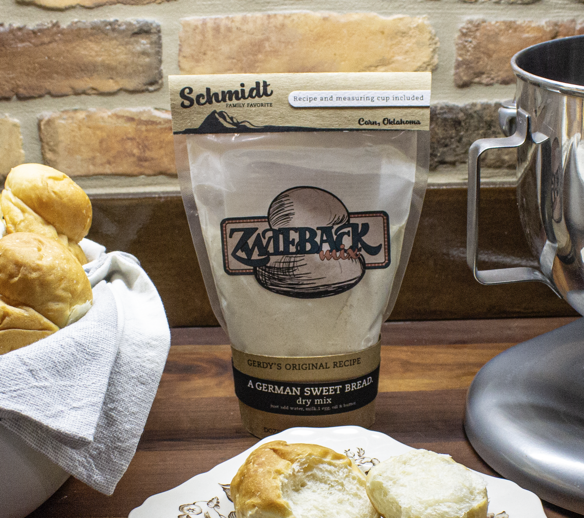
Harvest during the 1950s was a time of community for the little town of Corn, Oklahoma. ABP and Bernice Schmidt were newlyweds and took over Bernice’s family farm. After every wheat harvest, the Schmidt’s would host a gathering with all their neighbors and friends, who also just finished up their harvest. Families would gather and bring food, games, and handmade goods to share. It grew into a yearly tradition and was soon called “Harvest Moon.”
Moving into the ’60s, more and more families got word of the after-harvest celebration. Harvest Moon grew to the point that ABP and Bernice thought other people outside Washita County should get to experience what they were so blessed to be a part of. ABP and Bernice were deeply into planning, and they had everything lined up to turn Harvest Moon into a store, but there was one thing they could not come up with; a name.

In early July, after the 1965 harvest, ABP and Bernice were blessed with their fourth child Gretchen Kay, named after Bernice’s grandmother Margaret (Gretchen), also nicknamed Gerdy. Gerdy’s became the name for the store. In September of 1966, the Schmidt family opened the first Gerdy’s Community Market in Cordell, Oklahoma. By 1971 Gerdy’s had outgrown its’ little corner store, so the family opened a more extensive operation in Weatherford, Oklahoma.
In 2013, ABP was killed in a farming accident near Gotebo, Oklahoma. That was also the year Gerdy’s opened their 30th location in Alamosa, Colorado, opening three months after his accident. The opening was an emotional one for the Schmidt family, but looking back all those years ago, ABP and Bernice wouldn’t ever have imagined Gerdy’s growing as it did. Both were thankful that God allowed them to share their little piece of the Corn community with the central United States. They started from a place hardly on the map and now 15 states get to have a little taste of Corn, Oklahoma.

When ABP and Bernice Schmidt started Gerdy’s, they wanted it to be a place where their family, friends and neighbors could sell their farm-made products; produce, clothes, and baked goods. The Schmidt family saw the value in family operations and vowed not to sell products from large industrial farms. They wanted each store to have its unique products from families just like theirs. All the products sold at Gerdy’s Community Market were handpicked, made, and produced by small family operations.
During hard times in agriculture, such as the agricultural crash in the ’80s, Gerdy’s helped hundreds of families survive the severe loss in profits. Many families did not have to sell their generational farms and ranches because of the profits made from being a part of the Gerdy’s Community. Gerdy’s are also prominent supporters of local missions of the communities they are a part of.
GERDY’S LOGO
Our logo consists of a custom-made typeface that is specific to the store. This typeface is sprinkled throughout the store's branding, it was created by Jay Richert who was a neighbor of the Schmidts. The sun rising in the east represents new beginnings, nourishment, and vitality. The mountains turn into the plains, which symbolizes the store's coverage in the United States. You can see this mountain symbol throughout the store's products. Our packaging is unique to its supplier; therefore the symbol is used to brand the store products together.


HARVEST MOON
After each state’s harvest, stores within that state hold the traditional Harvest Moon Festival, a day filled with home-cooked food, games, arts, and community encouragement. People from all over the state come together and celebrate the end of summer or fall harvest.


LOCAL MEAT
All meat is locally grown and processed right here in Gerdy’s butcher department to ensure freshness. The location of the store plays into what type of meats are sold. Going directly to the rancher ensures they get top dollar for their product without having to sell their livestock to a large company. Customers can ensure their meat is local, and the animals will be treated in the most humane manner.


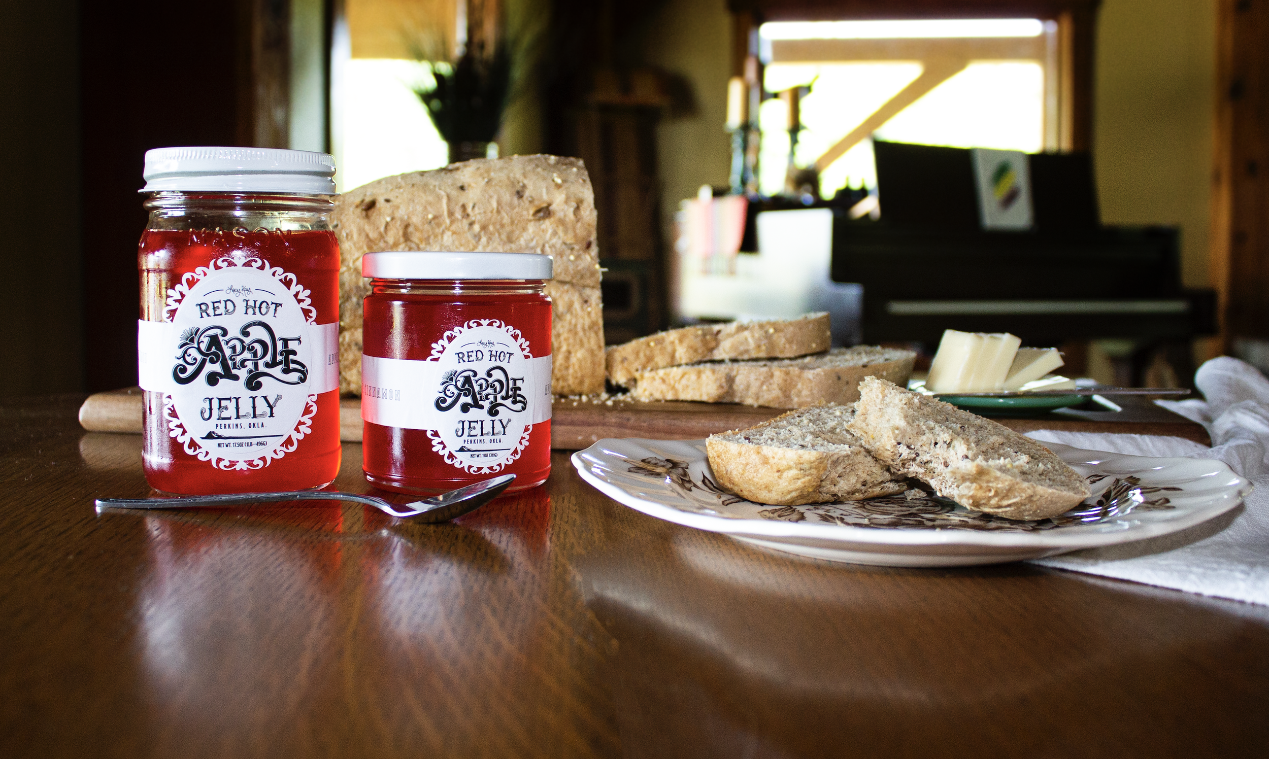
GREEN CHILE
This green chile company was based on a group of ladies who got together every year and did an activity together to stay in touch with one another. Each year they had different themes for their gatherings. They once had a year canning some green chiles from one of the girl’s farm down in New Mexico. The theme of the weekend was “Quit Your Belly Achin’” which became the name of the product. It became so popular that Gerdy’s picked it up and is now selling it in their stores. The glass jars are part of our glass exchange program. Customers can bring their glass products back to the store for a discount on their upcoming purchases. The canning jars are then shipped back, cleaned, sanitized, and reused.


LOCAL PRODUCE
Produce is packaged according to where it originated. All materials being used will be biodegradable to help reduce waste, and the container is made up of recycled paper pulp. The packaging will showcase the family’s story to build a personal connection with the customer.


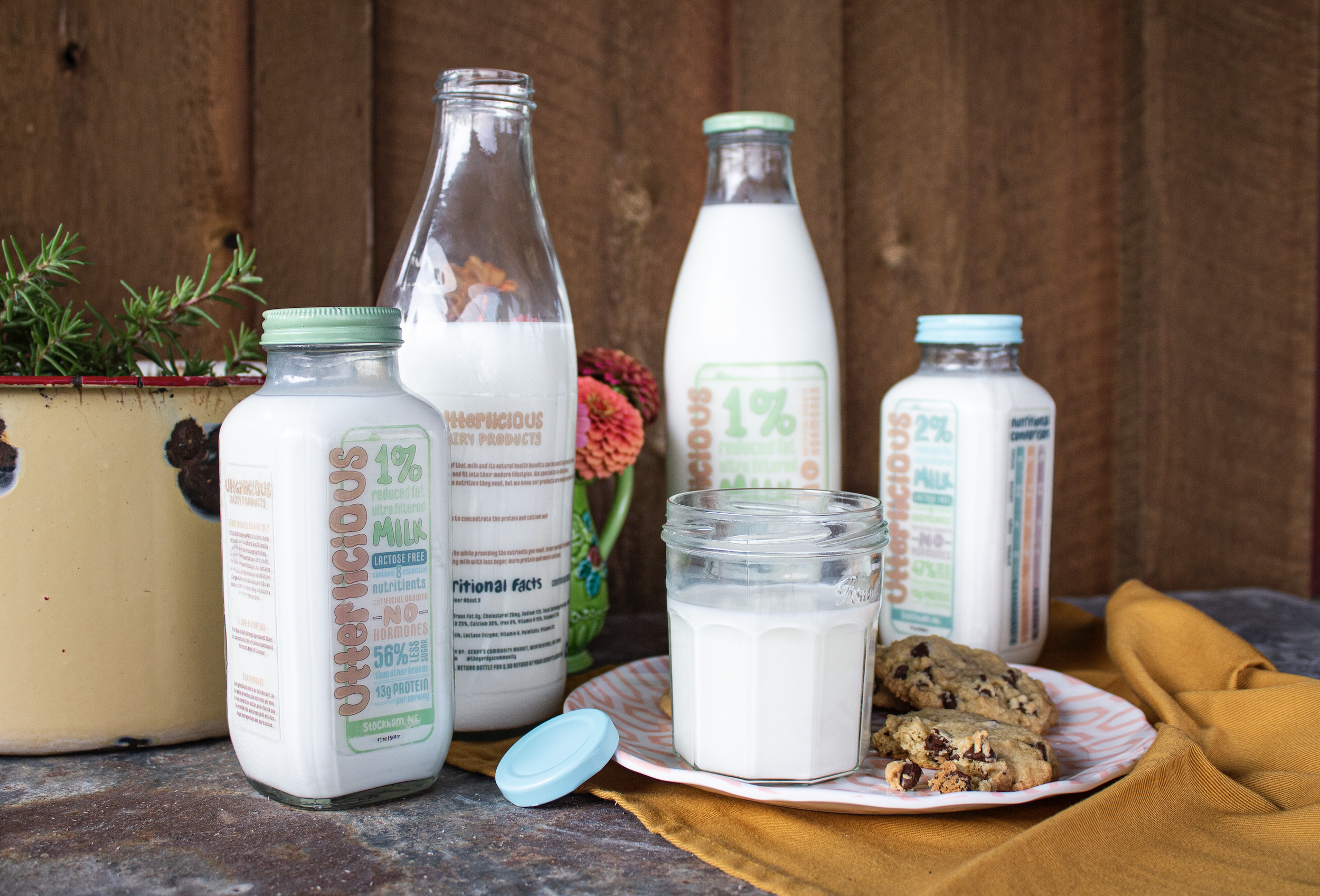
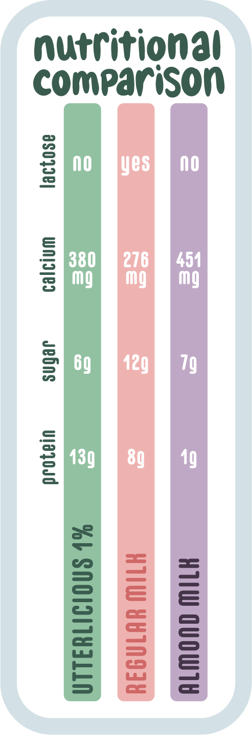
FRESH MILK
Our dairy products are within driving distance from their supplier to ensure fresh quality. Utterlicious is a company that specializes in ultra-filtration which filters out lactose and provides the most health benefits while minimizing the sugar contents. Each bottle is made with recycled glass and is part of our exchange program. Customers can bring their glass products back to the store for a discount on their upcoming purchases. The glass bottles are then shipped back to the dairy, cleaned, sanitized, and reused.


HOMEMADE BREW
In the spring branding of 1949, Gerald Wolfenden brought his first round of brew to share with the rest of the ranchers. It was rough tasting, but no one cared due to the high alcohol content. Every year for the next 27 years, Gerald brought the brew to each branding. By the end of those 27 years, Gerald had mastered the flavor.
This would later become the Tied Hard and Fast (one of the many things Gerald was known to do). His grandson Boyd took an interest in what his grandfather was making. He also loved hearing the stories his grandfather told him about the crazy things that he had done. Boyd decided to share his grandfather's stories through his brew and established the Wolfenden Brew Ranch.
Each beer flavor of the company is based on what he learned from his grandfather.


FRUIT JUICE
This juice company is perfect for getting your daily quota of fruit. Pucker Up Buttercup is a juice company that strives at being as natural as possible. The labels are packed with color and flavor to match the feeling of the flavor inside. These bottles are part of our glass exchange. Customers can bring their glass products back to the store for a discount on their upcoming purchases. The glass bottles are then shipped back to the company, cleaned, sanitized and reused.